A Naomi Paper Co. Wedding

The mood board I used to dictate each detail of the designs.
As a graphic designer, designing everything for your own wedding is simultaneously a dream come true and your own worst nightmare. You alone are the only person you trust to make everything look just right, yet you alone are your own worst client!
But being able to design and produce each piece for our wedding saved us countless time and money. This was pivotal in making our short engagement possible (and still beautiful). You can read more about planning a wedding in 5 months here.
In this post, I'm giving you an inside look into each design detail I created for the big day.
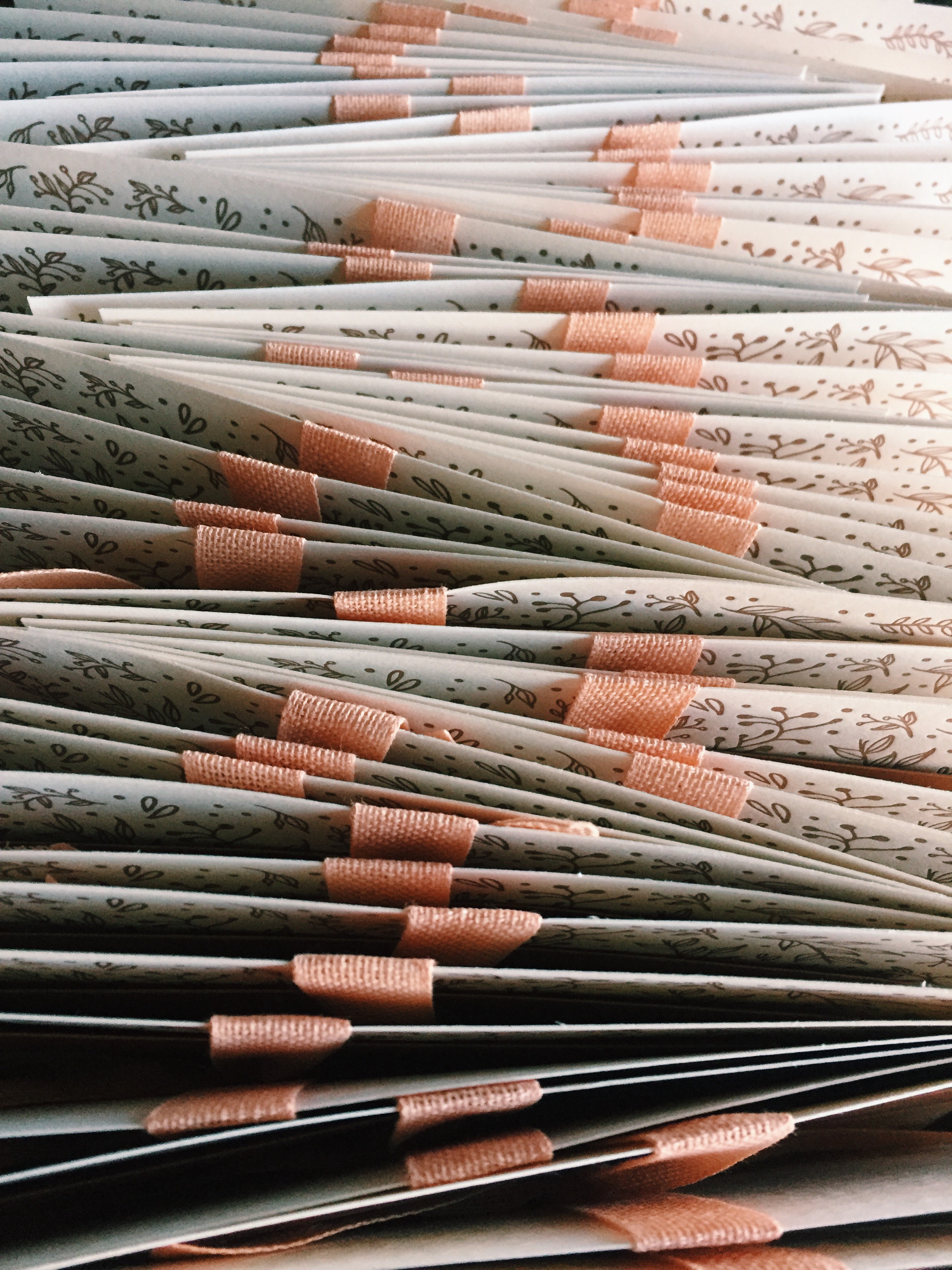
Invitations
Now, this is going to sound weird...and creepy...but bear with me.
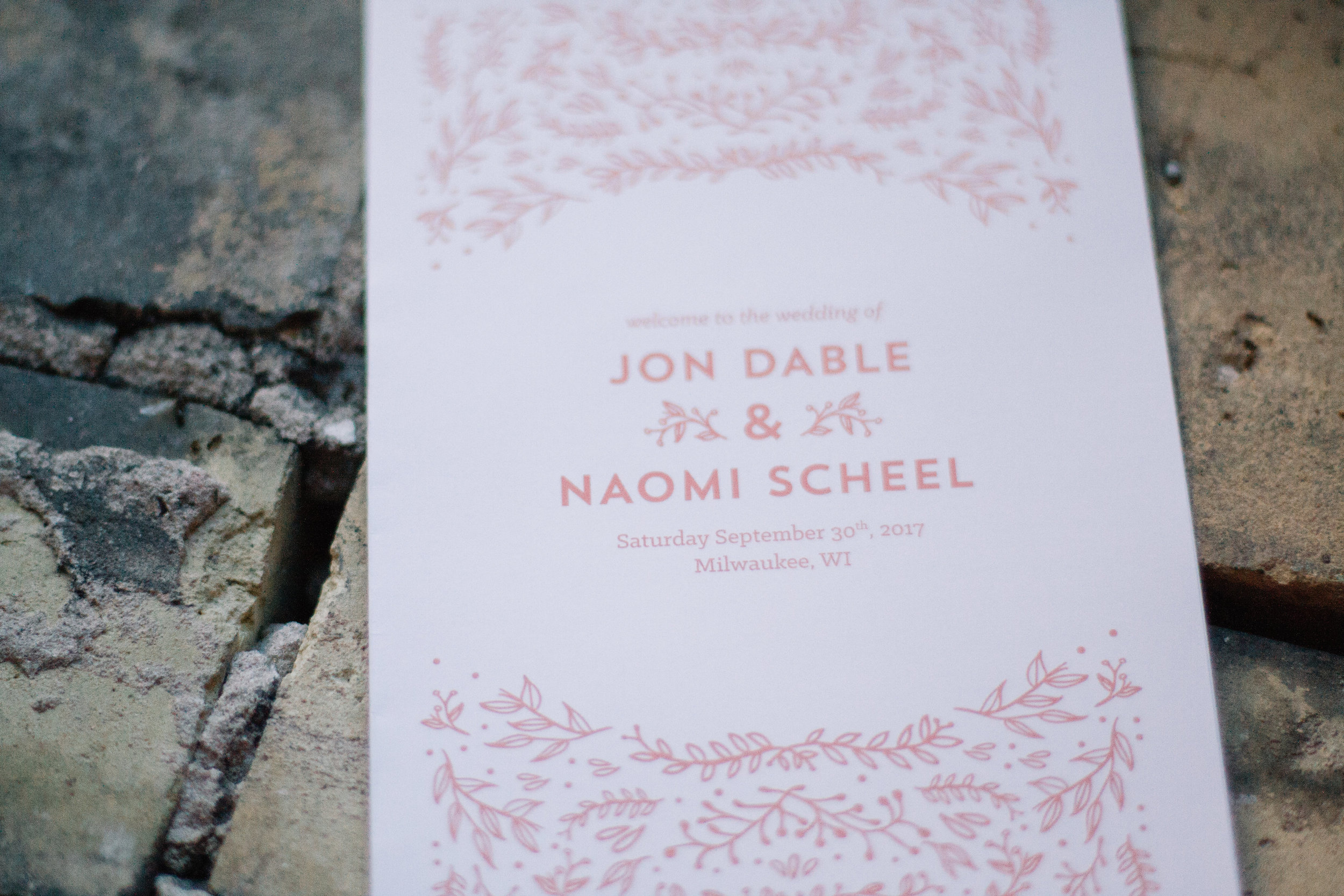
I designed our wedding invitations before we even met.
Months before I met my husband, I was participating in a design challenge on Minted to create a wedding invitation that could be used as a template for other couples. The deadline for the challenge was due at midnight and I had nothing, so I repurposed the floral elements in my one of my art prints to quickly make a design to submit. Only there was one problem: the due date had been 10am that morning—I missed it! In turn, I was left with a wedding invitation for no one, and a heap of disappointment. I nearly deleted the design, but decided to hoard the file anyway in case one of my friends would get engaged in the near future.
In between then and meeting my husband, I repurposed that same floral pattern to make the Thank You letterpress greeting card. I fell in LOVE with how the design and pattern looked letterpress printed, and loved working with Bay View Printing Company in the process.
Once we got engaged and chose our (very close) date, I officially became that client with the trifecta of needing something fast, well done, and cheap!
But thanks be to God that he was working through my "wasted time" designing that Minted invitation and printing those thank you cards all to make a short engagement with my dream man possible! At least that's the way I like to see it...
The end results still make me swoon!
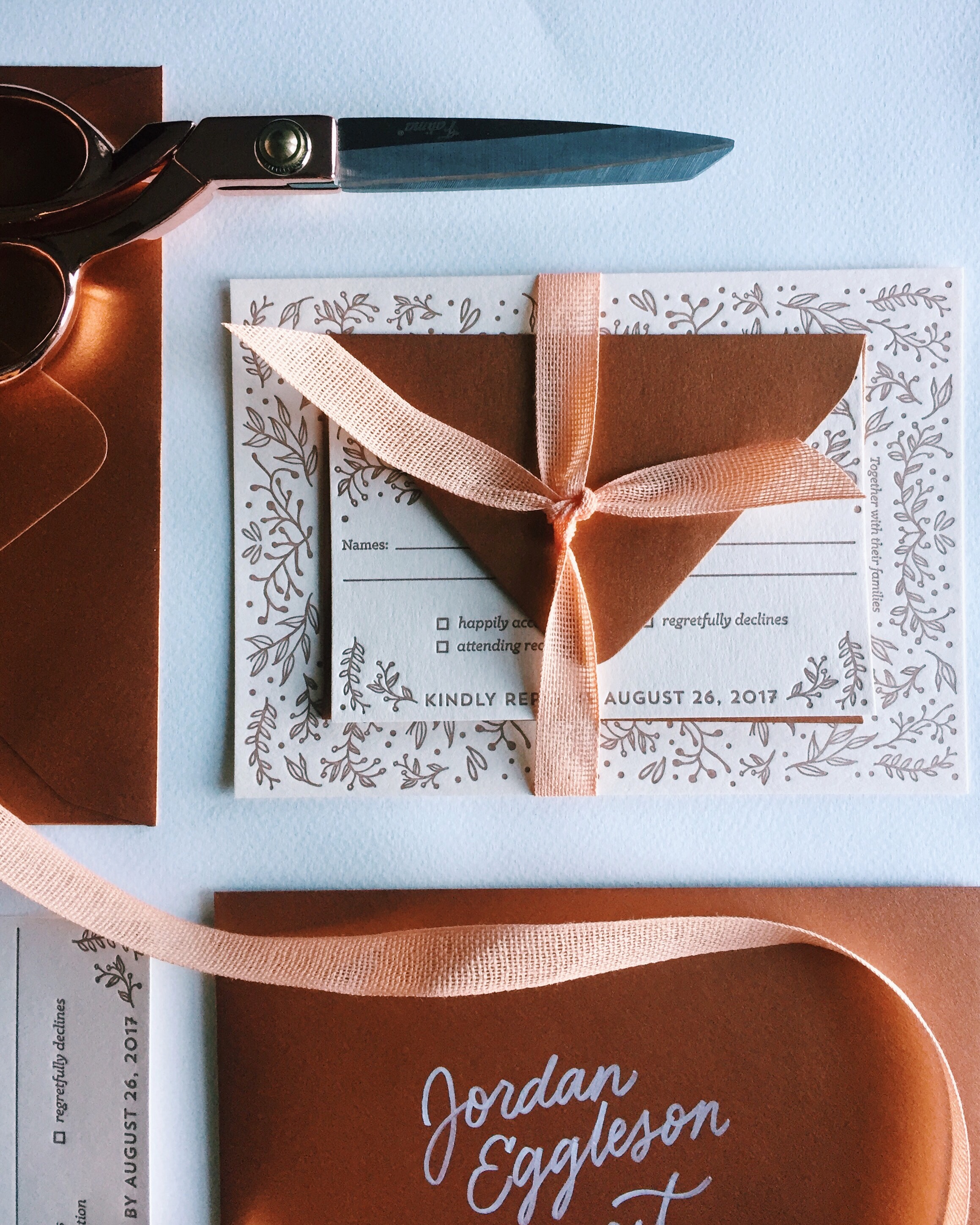
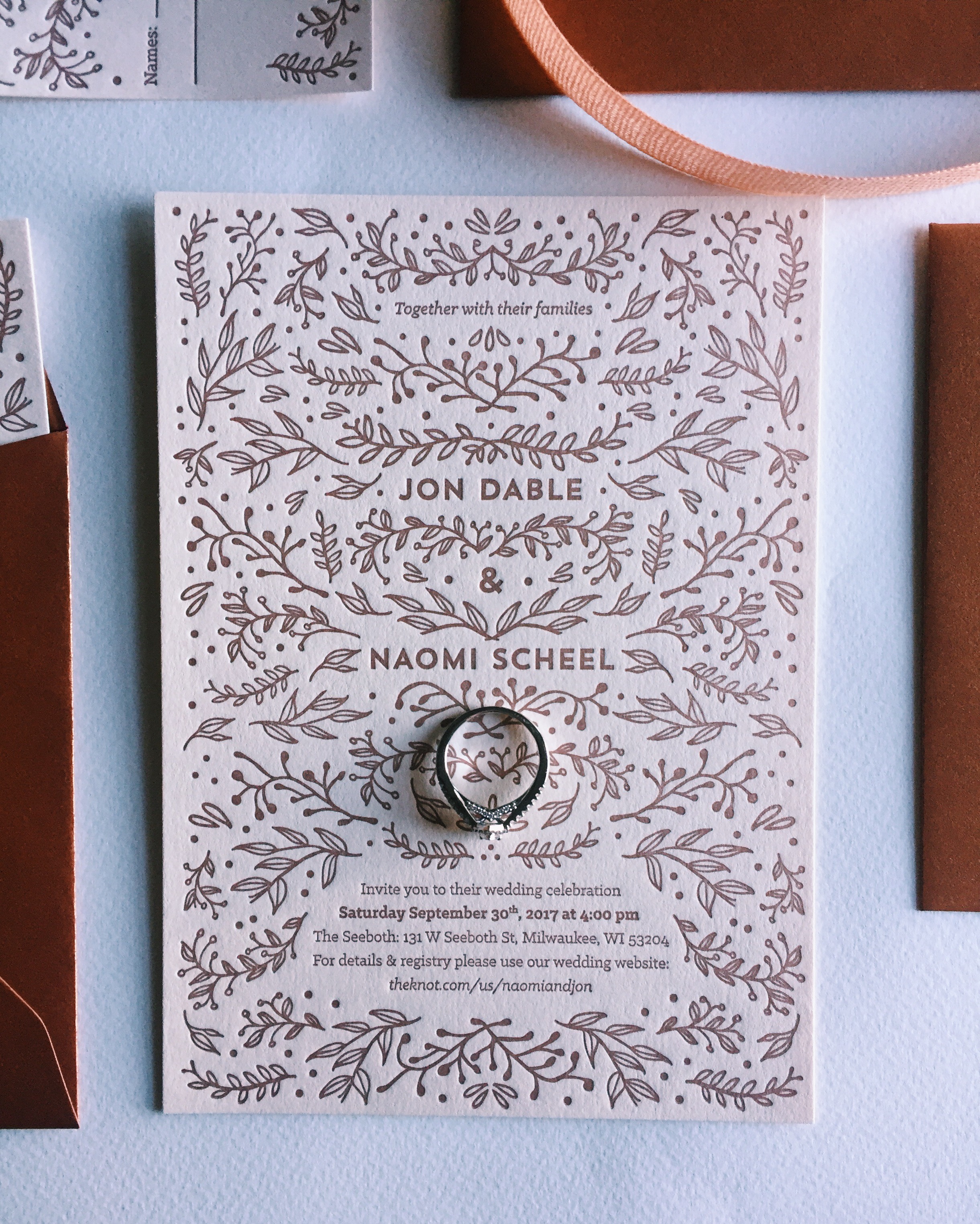
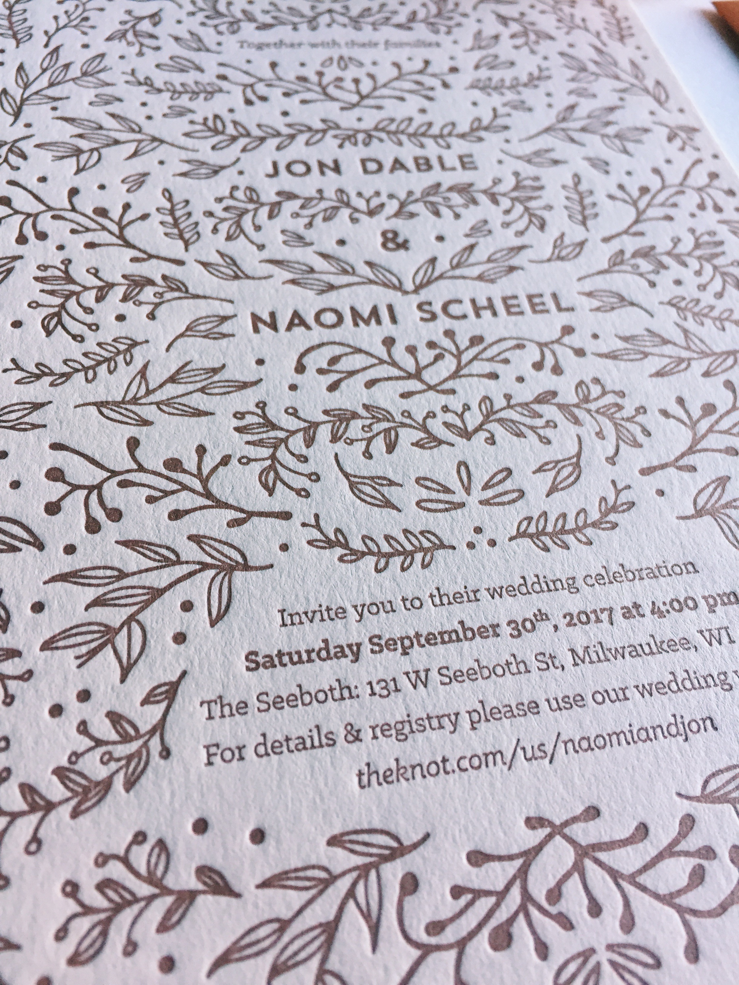
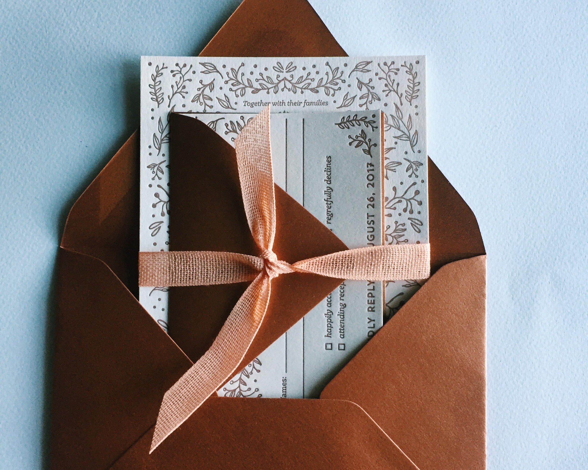
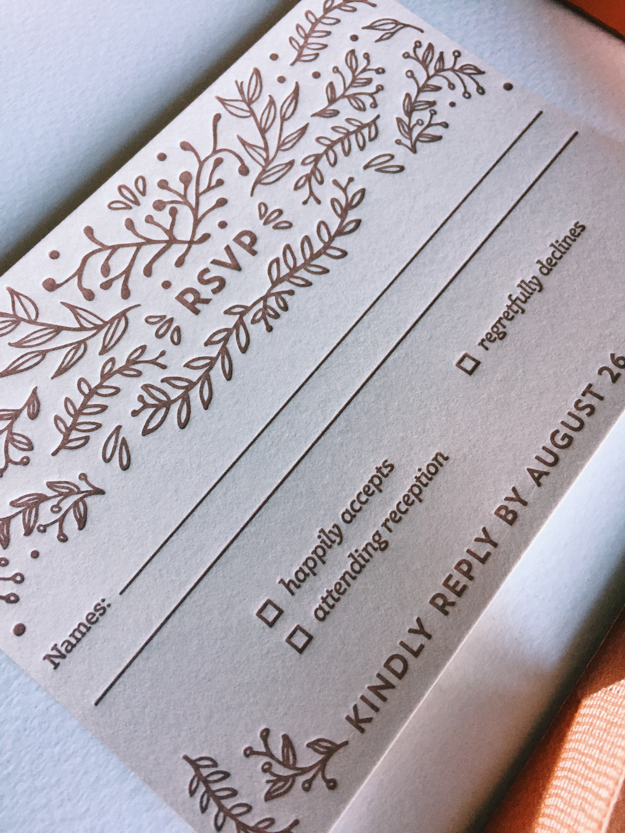
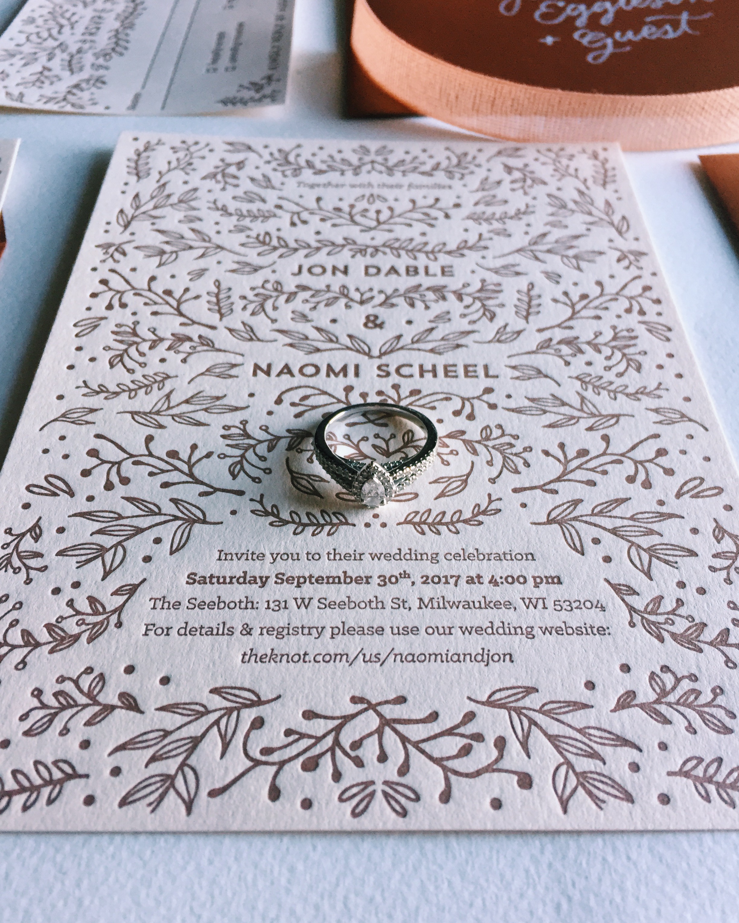
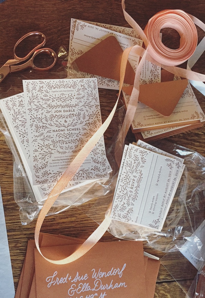
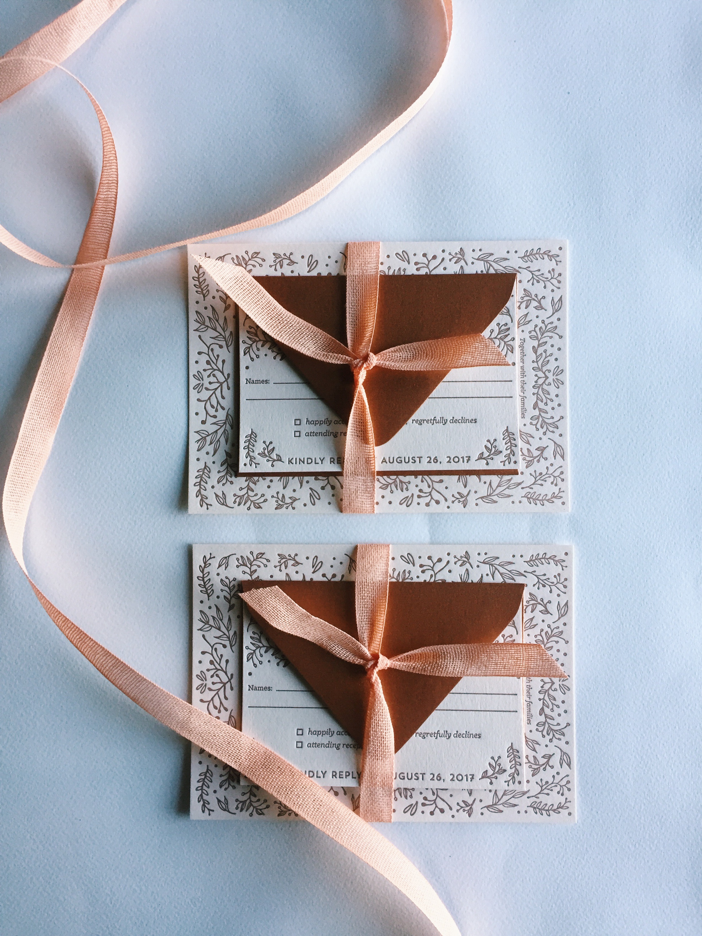
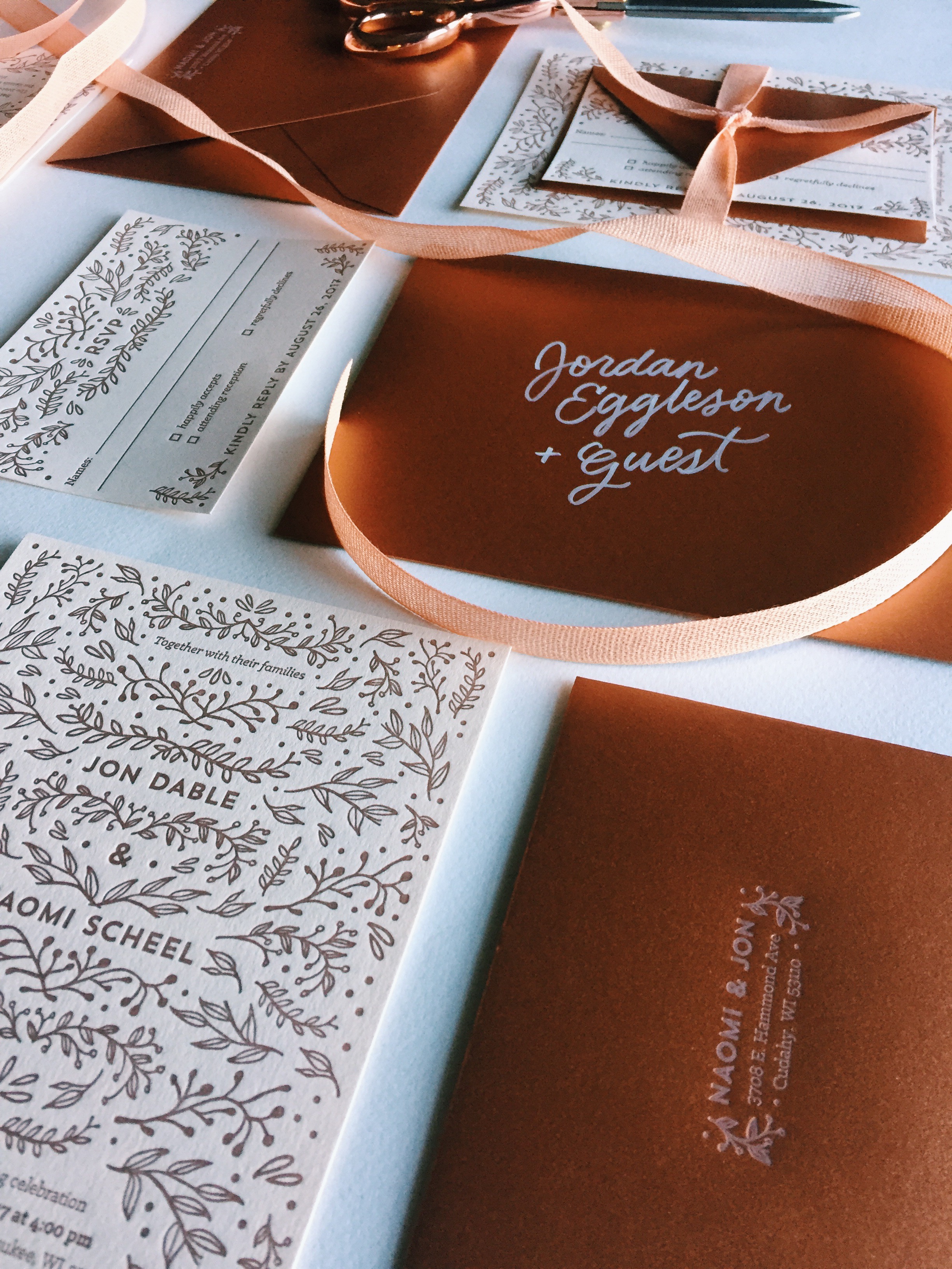
Printing: Bay View Printing Company
Ribbon: Broadway Paper
I'm often asked why I didn't hand letter the invitation design itself. In short: time, and for the sake of not creating anything too trendy. My hand lettering is constantly improving, and things I've lettered only 6 months ago I look back at now and want to change! With this design, it had the hand drawn elements in the foliage, but without the lettering element that would have added a LOT more time and that I may have disliked later. I still hand lettered and addressed each envelope, though, fitting with my practice!
Establishing a Brand
Essentially, the invitation design acted as the "brand guide" for the entire wedding.
Thus the foliage, typefaces, and hint of hand lettering on the envelopes served as the basis of all visual and design elements for the day.
When planning your own wedding, I highly recommend hiring the same calligrapher/designer to handle all visual aspects of your wedding. Your love is unique, and deserves it's own special brand that is consistent through the whole event—from the save the dates to the thank you cards. You can always contact me to inquire about custom wedding work!
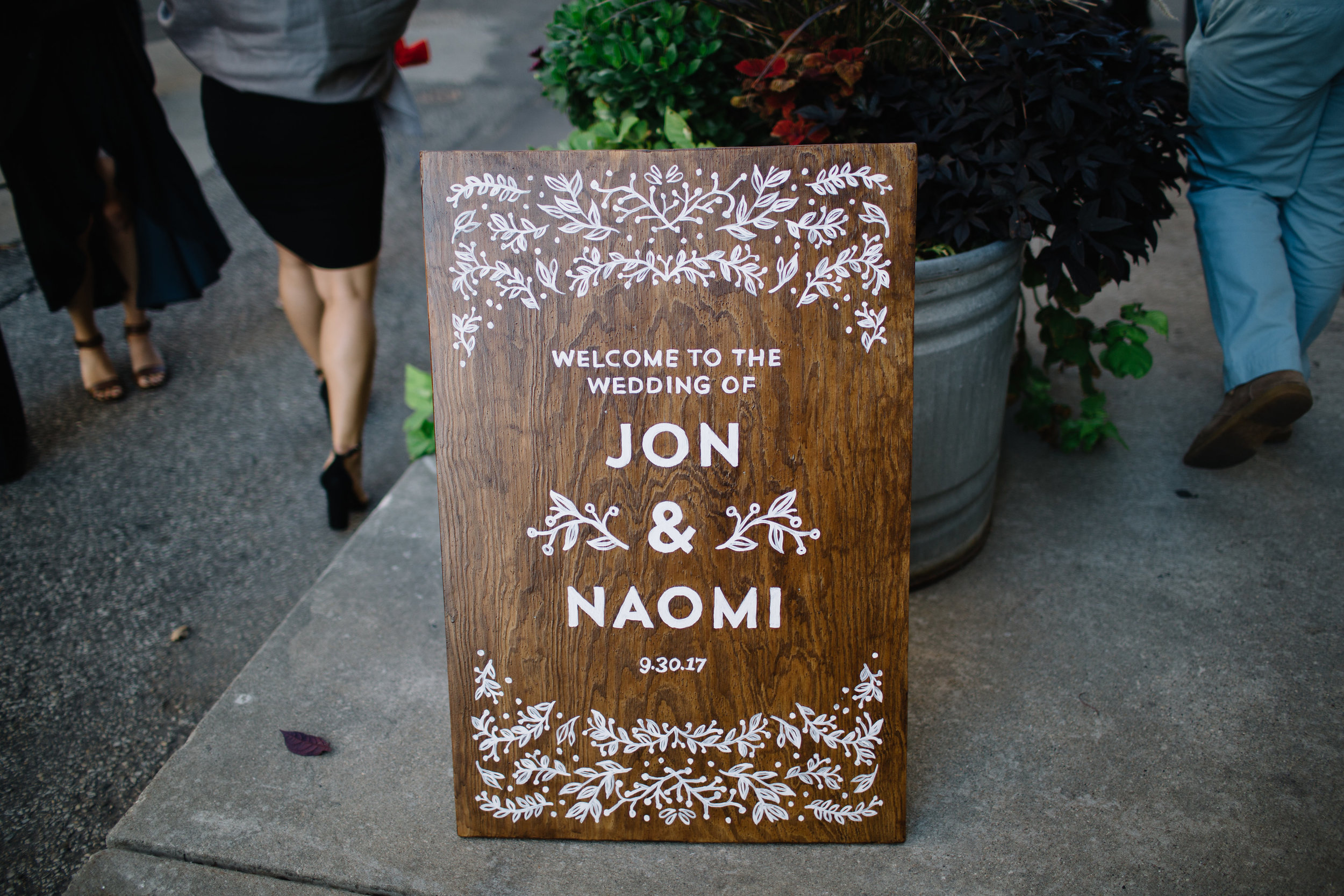
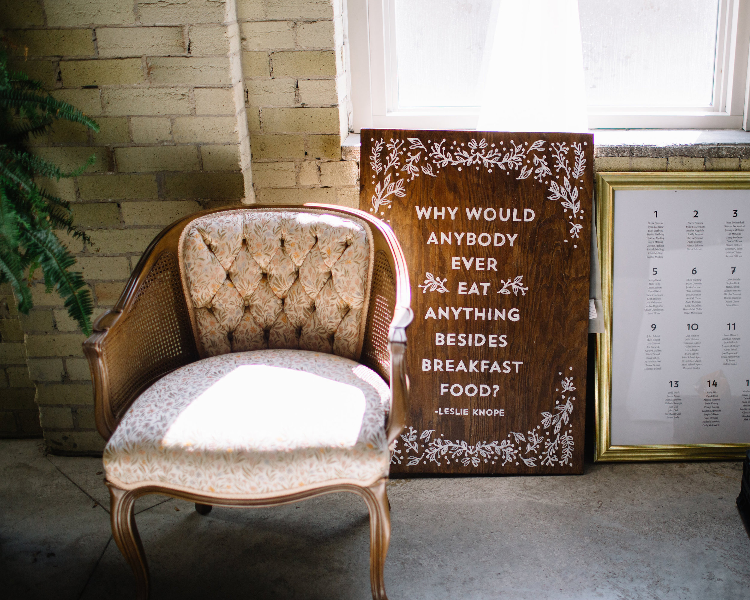
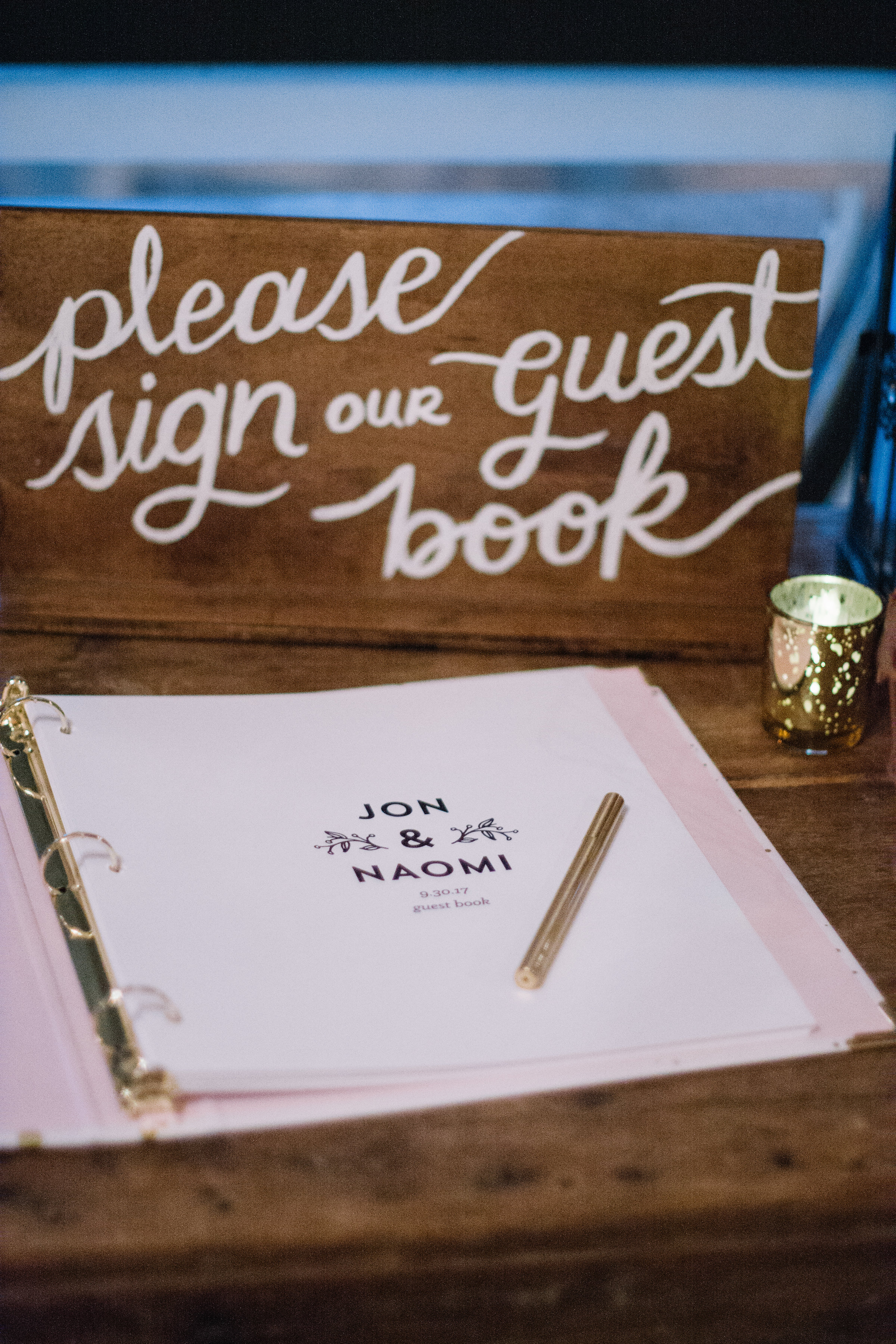
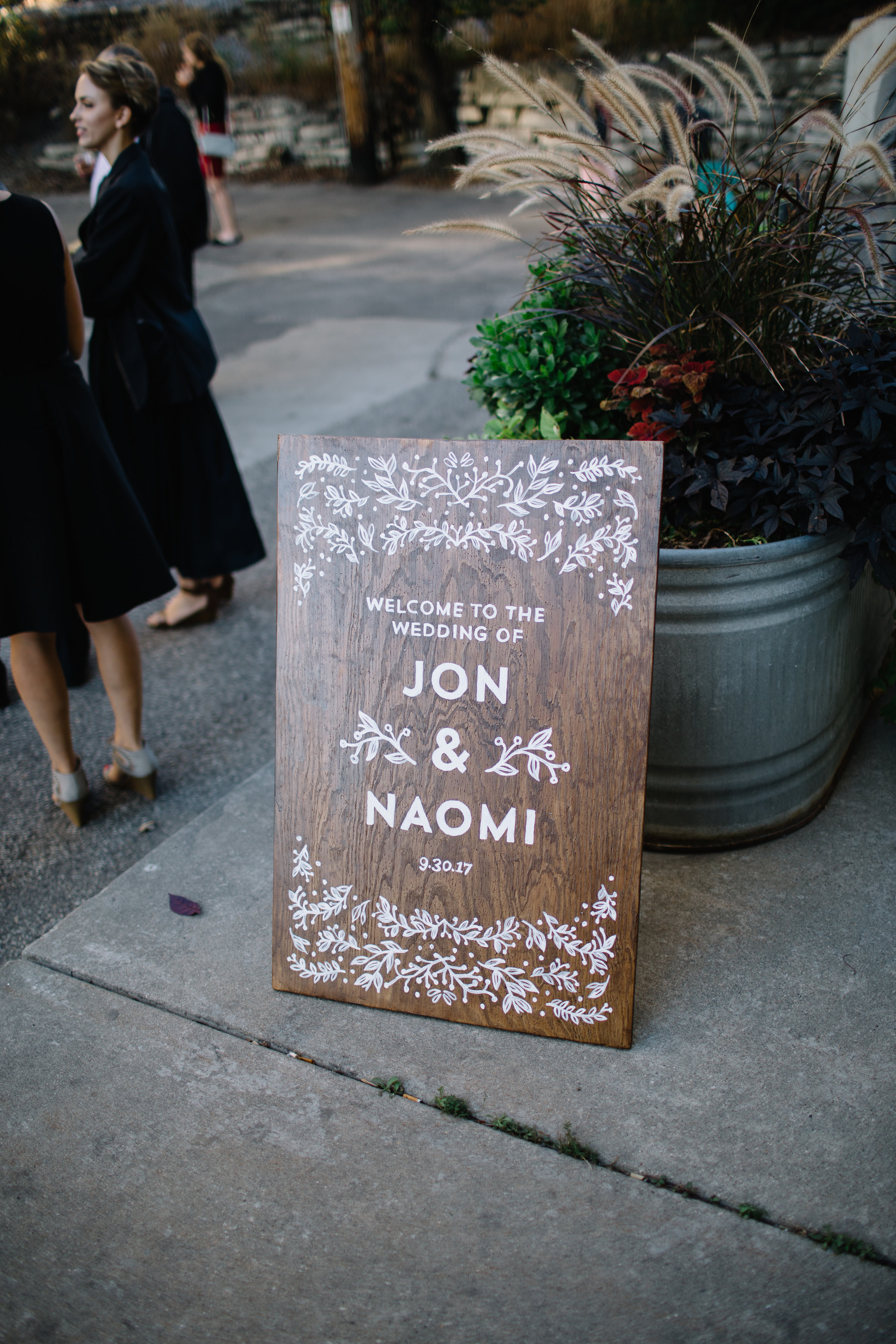
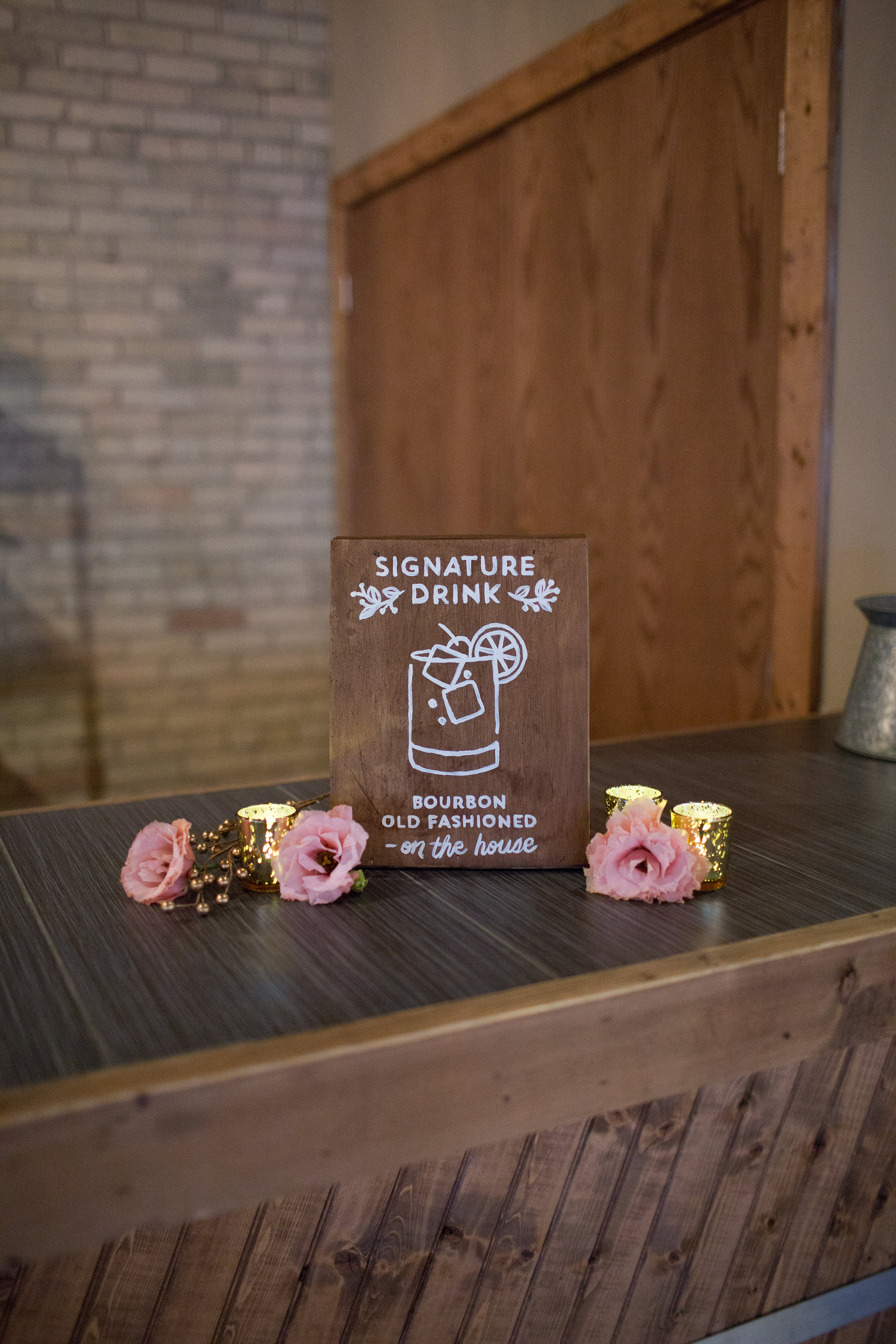
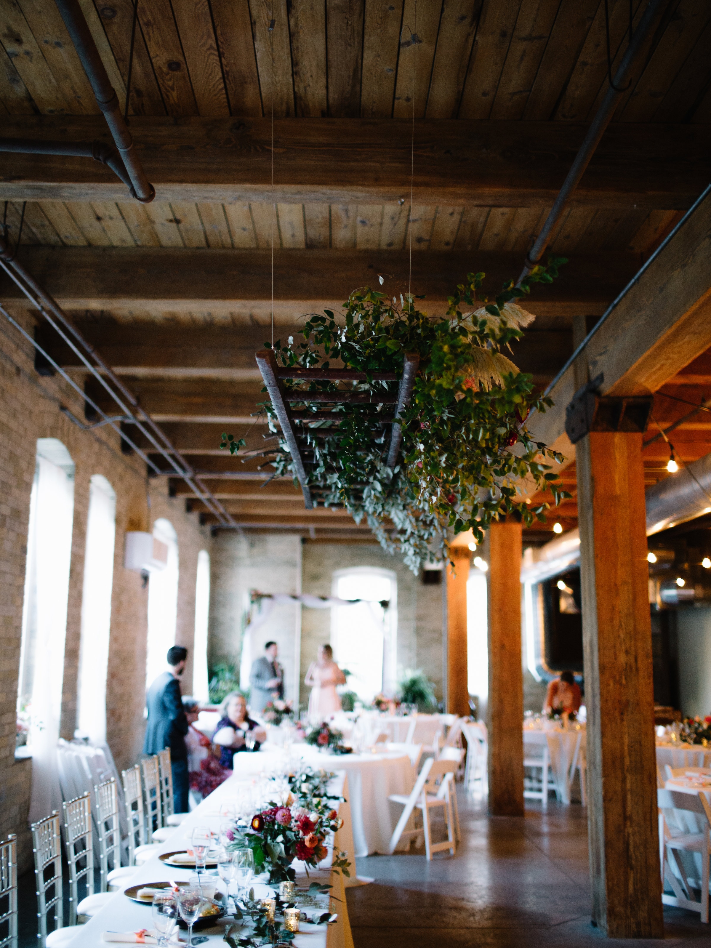
Signage
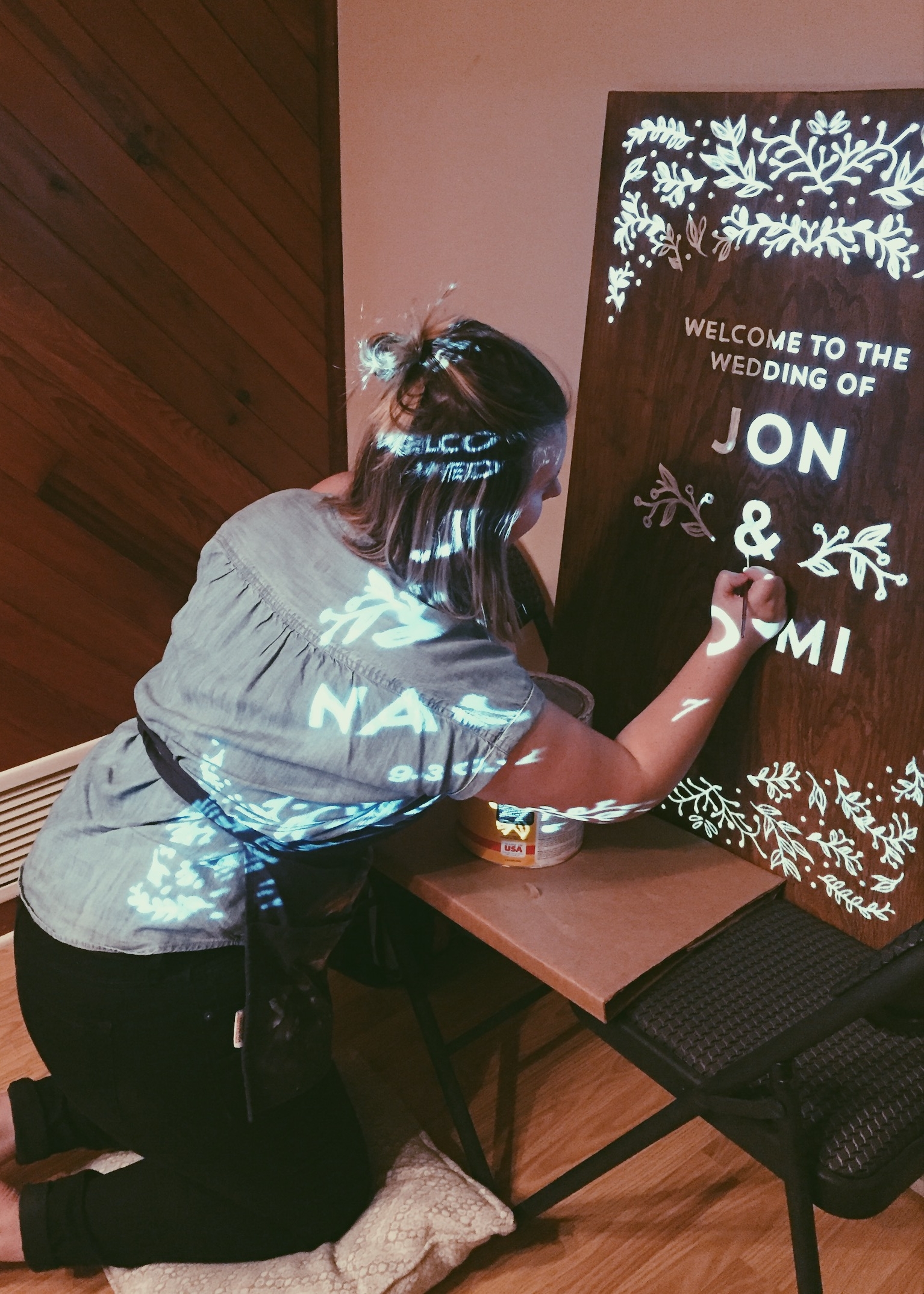
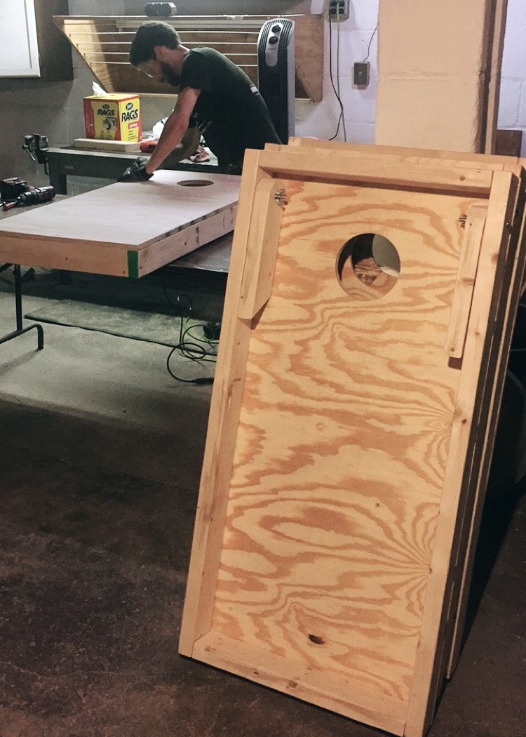
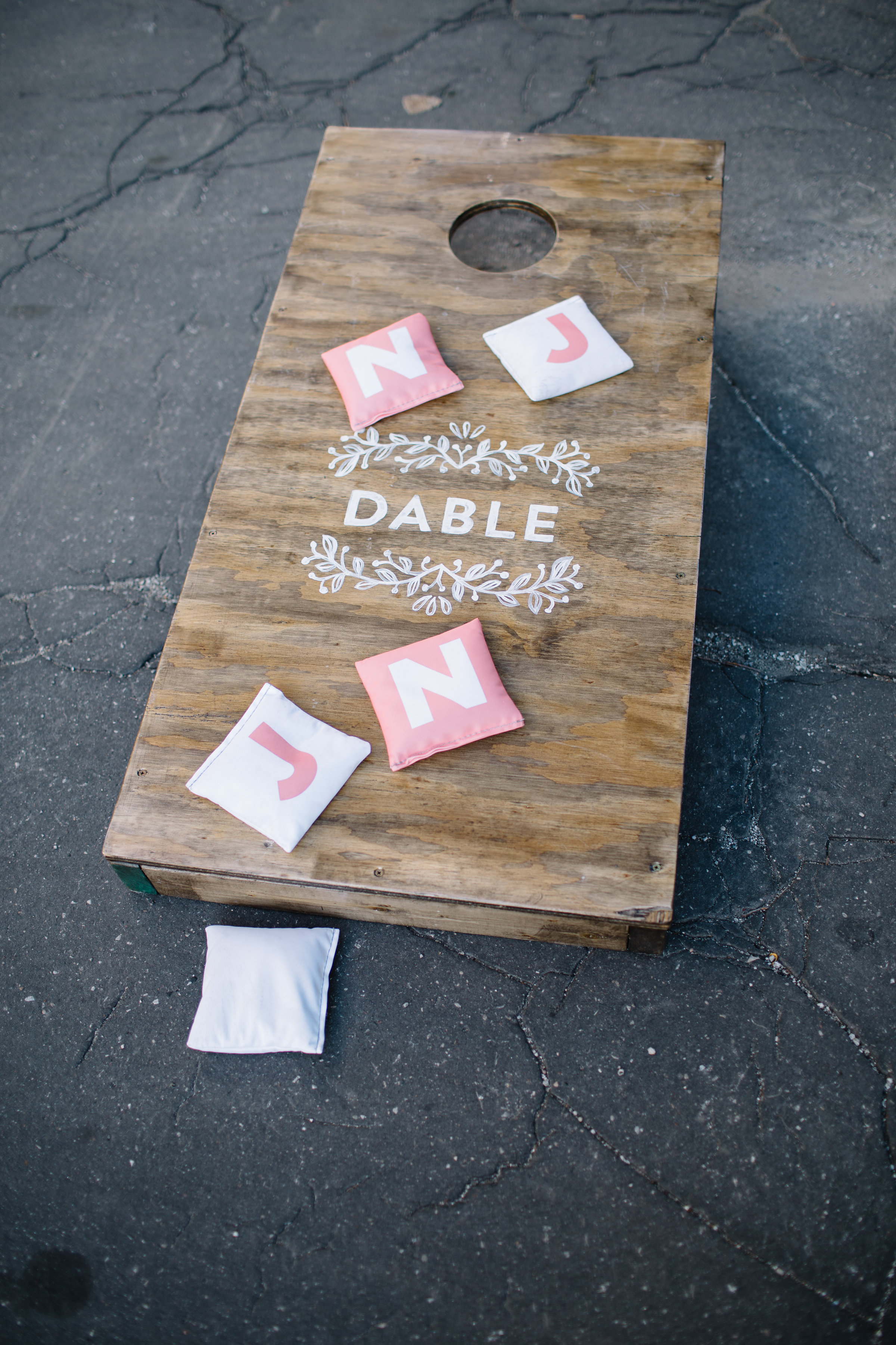
Keeping in brand with our invitations, I began to design each sign that would be at the wedding. This included the guest book sign, welcome sign, "breakfast for dinner" sign, signature drink sign, dessert table sign, and our very own custom corn-hole (bag toss) boards. In nearly all of these, we used a dark stained wood that matched the exposed beams in our wedding venue.
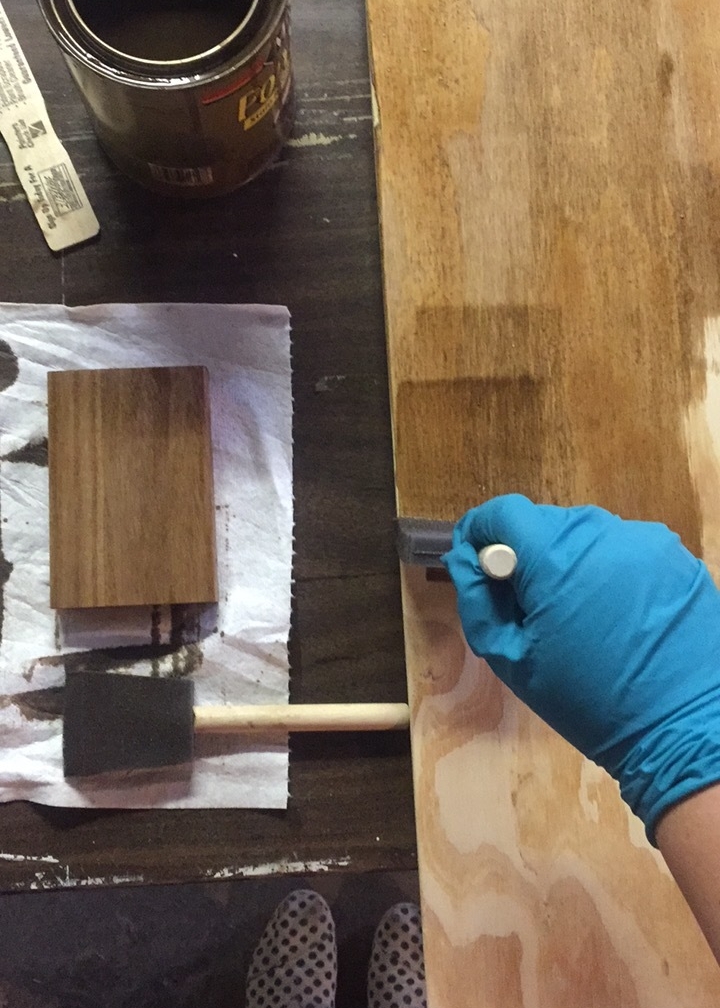
For our Welcome, Breakfast for Dinner, and corn-hole boards, we bought plywood at our local home improvement store to build and stain them ourselves.
Once I had the dimensions (approximately 2x3'), I created the designs in Adobe Illustrator, and used a projector to project the design onto the boards. I then painted directly over the projection. Since then, this is the only way I do large paintings/murals of lettering and illustration, it was so convenient!
By not using hand lettering on the invitation itself, the design became SO versatile and easy to work with when it came to the signage and other elements for the day. I was able to design each of these signs in only about an hour, saving me so much time (and sanity). And the end result was simply stunning.
Photography: Emily Valentine Green Bay Photo
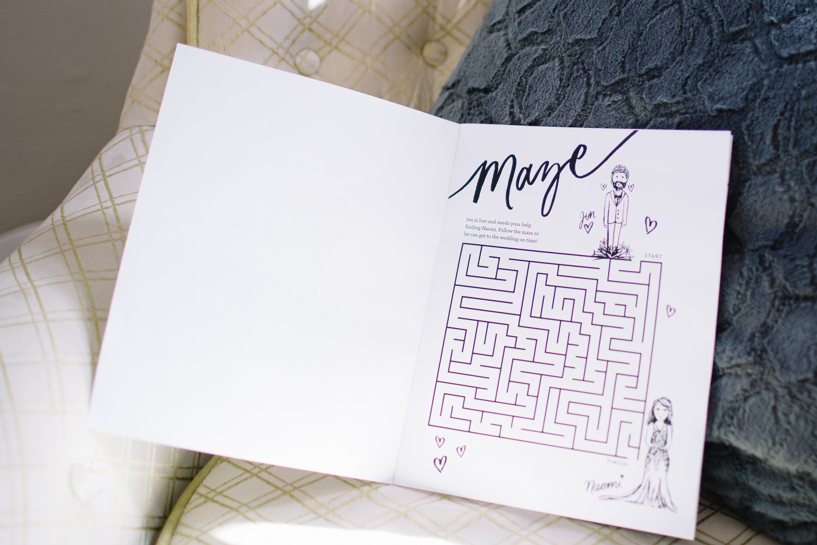
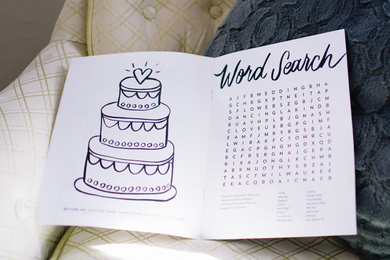
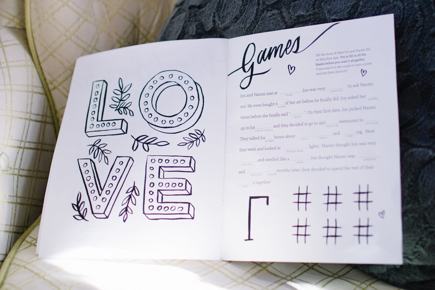
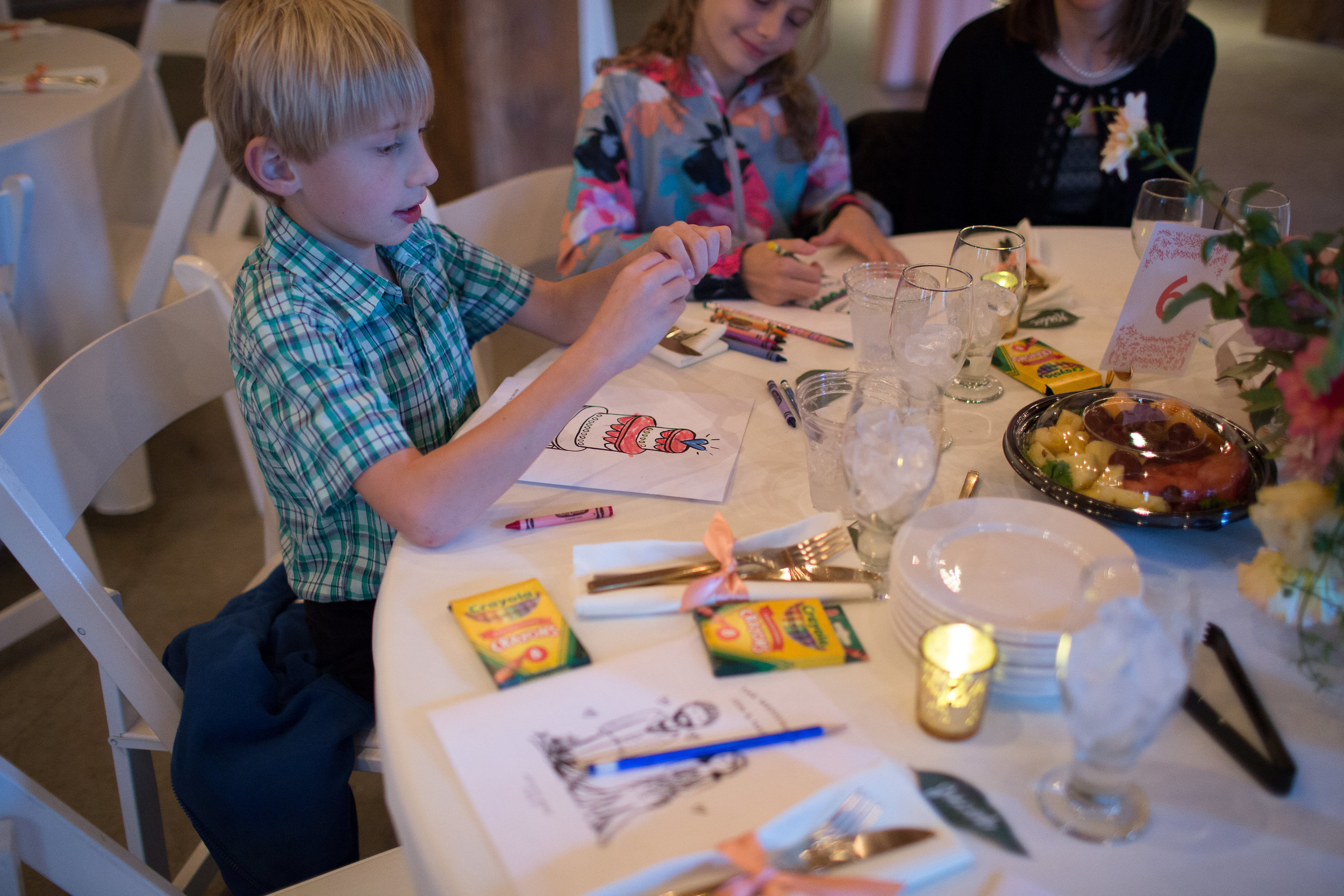
Kids Activity Book
File this one under: dream project.
Is there anything more fun than designing for kids? I'm pretty sure there isn't after designing our own activity book for the kiddos (and adults) at our wedding. Jon and I have a number of nieces/nephews, little cousins, and friends with kids, so we wanted our wedding to be equally fun for them too! Each page had custom lettering and/or illustrations that were personal to us.

The pages included:
a maze (playing on the joke that Jon always gets lost..)
a word search made up of words about our love story
hand lettered "LOVE" design that you can find in my shop today!
an illustrated cake to color and decorate
mad-libs about our first date
We had Hershey Kisses and sets of bubbles at our seat to give each child (or adult) that came up and read their mad-libs aloud to us. It was so much fun, and I'd highly recommend having something like it at your own wedding if there will be many kids. I'd love to design a custom one just for you!
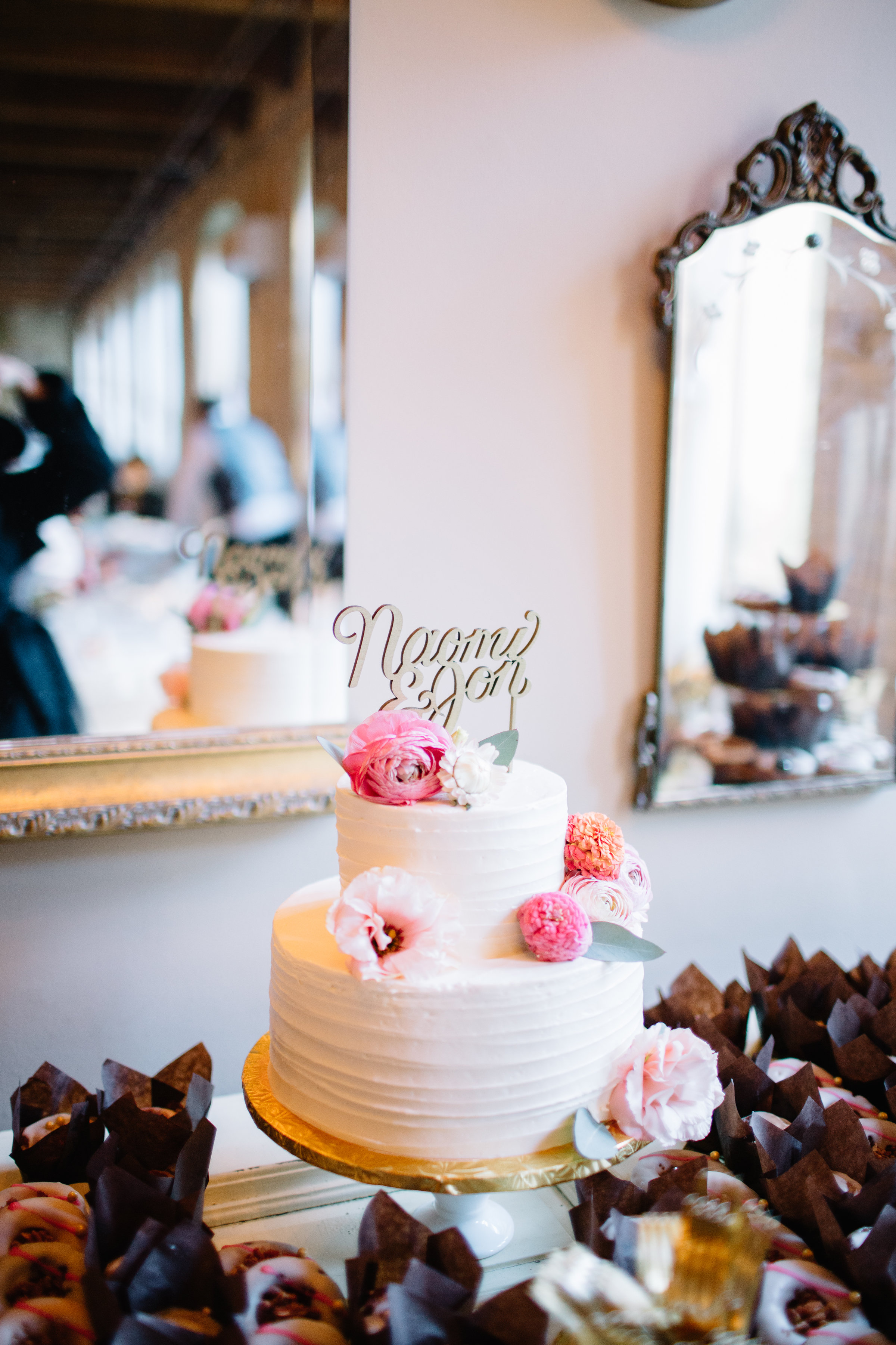
The Dessert Table
Another area of the wedding near and dear to my heart: the dessert table!

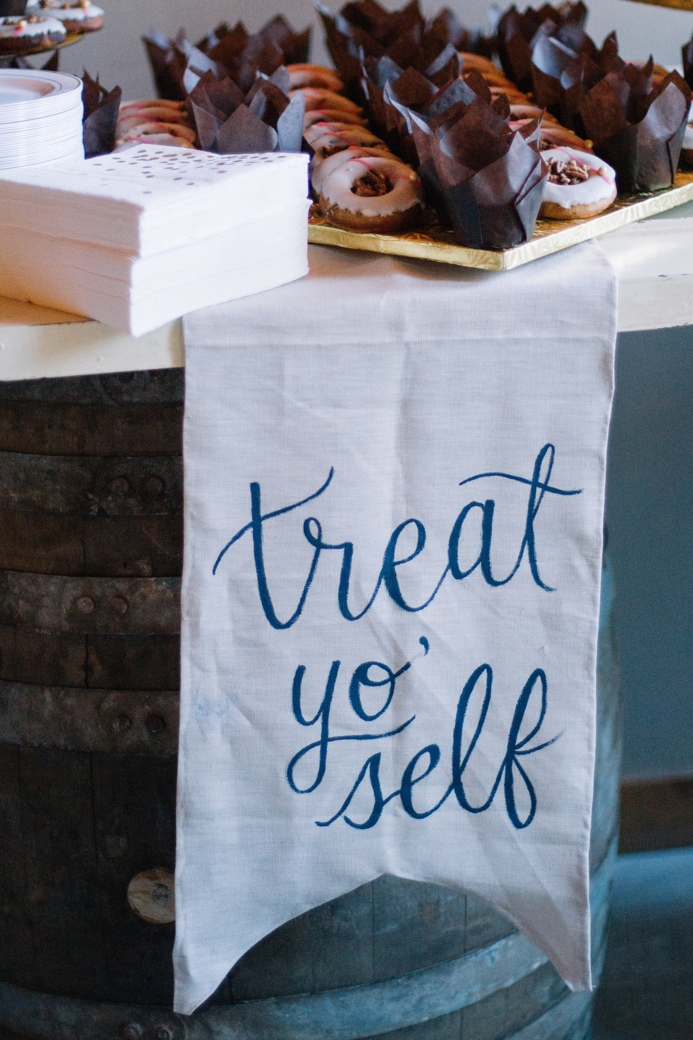
With our homage to Leslie Knope in our Breakfast for Dinner sign, we decided to stick with that Parks and Rec theme in our "treat yo' self" banner on the dessert table. To make it, I bought a yard of linen fabric and some seam glue at our local Joanne Fabrics store. I cut the fabric to shape, and used the seam glue along the edges to create a hem. Next, I used paint to free-hand the lettering onto the banner. If I were to do it again, I would probably have a friend sew the edges for me, and use a fabric marker instead of paint. Nevertheless, people still loved the humor of it and it looked beautiful!
My favorite part of the dessert table (besides, you know, the amazing gluten free desserts) was the hand lettered cake topper! It was such a fun challenge to create a design where each element was connected to each other. My maid of honor, Chelsea, laser cut the design out of wood and spray painted it gold. I definitely plan to use it again for our anniversaries to come—it's so beautiful!
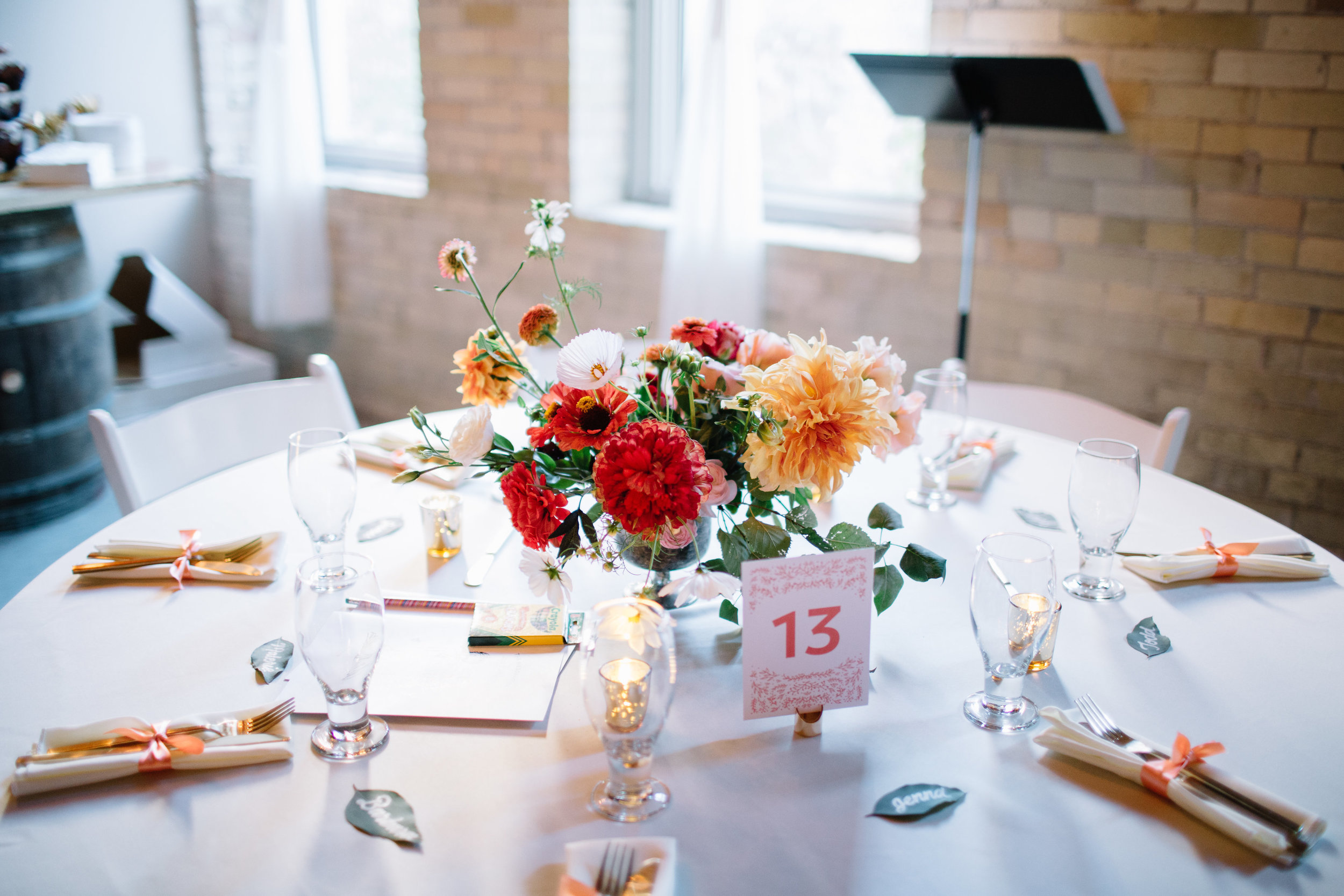
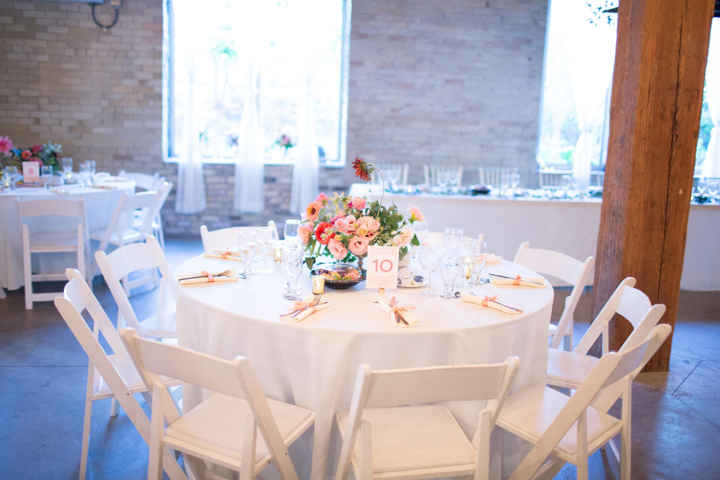
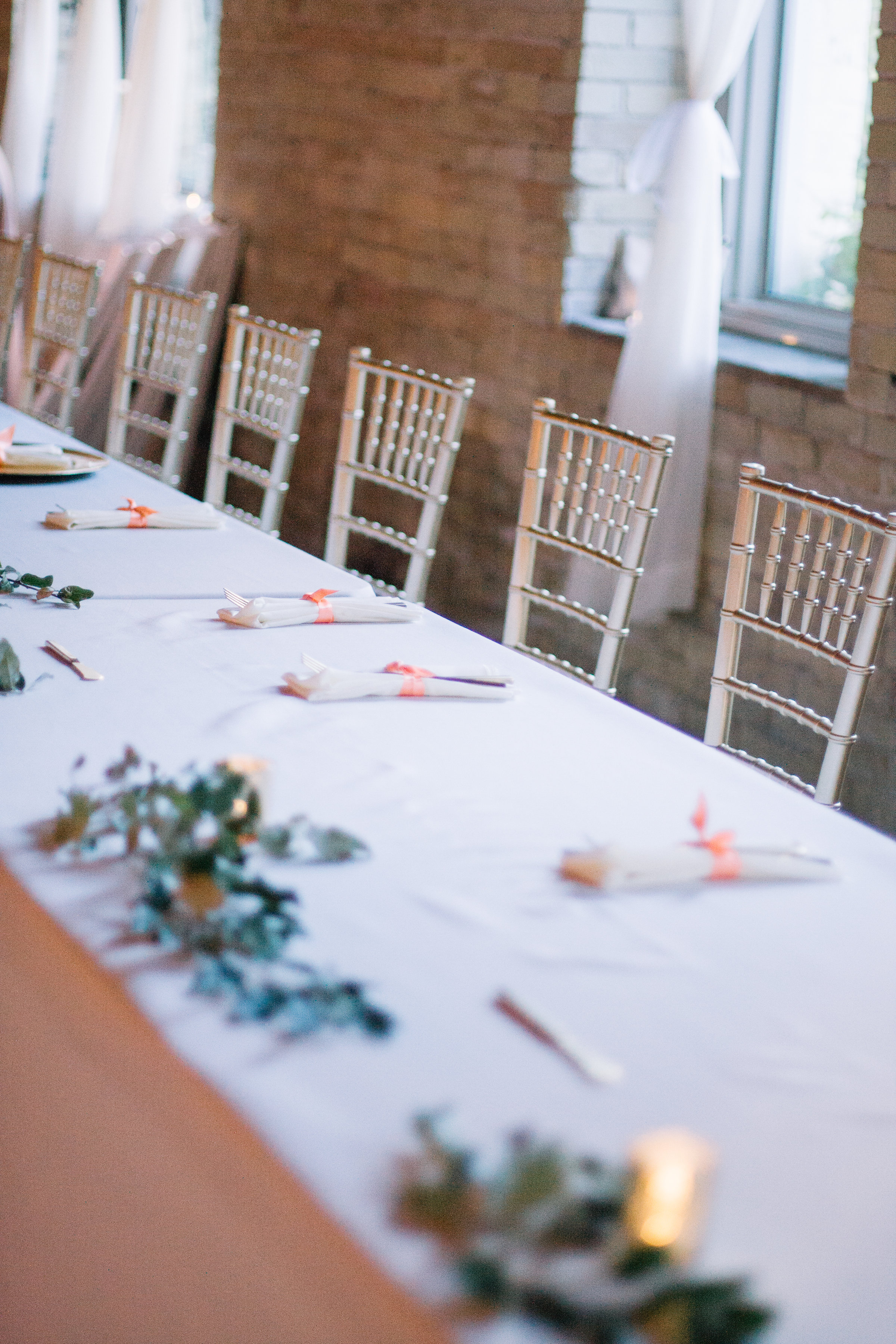
Table Numbers & Place Cards
As each table was adorned with beautiful Sweven Floral arrangements, the design elements needed to be equally delicate and beautiful.
Again, I was able to easily repurpose the invitation design to make the table numbers. I designed them to be visible on both sides to make it easier for our guests to find their tables. (We used these place card holders to hold the table numbers.)
But one of the biggest labors of love were the hand lettered eucalyptus leaf place cards. They turned out beautiful and were totally worth it—despite the emotional breakdown I had when I realized they were beginning to dry out! So in order to not let them dry, we put them in a plastic bag according to table number, with a very damp paper towel. On the day of the wedding, my friends and family helped take them out of the bags and arrange them at each table just 20 minutes prior to our guests finding their seats. I used this pen on both our invitation envelopes and the leaves, and it held up really well.
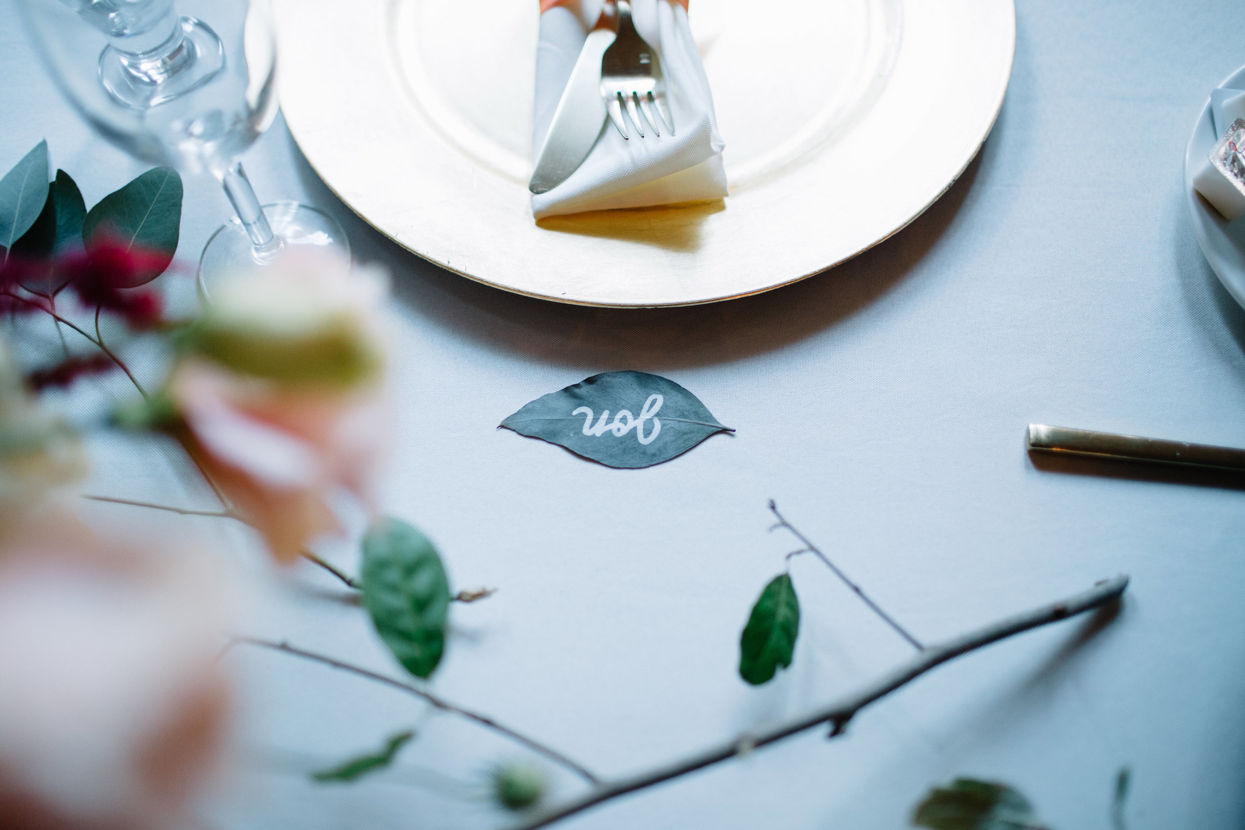
Photography: Emily Valentine Green Bay Photo
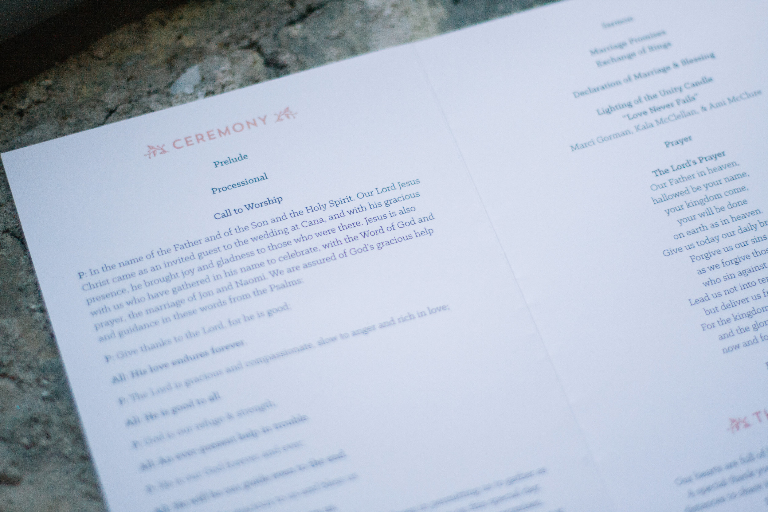
Wedding Program
Last but not least, is our wedding program! Again, I followed the same colors, typefaces, and design elements present in our invitation design and mood board. Getting the pattern yet? Consistency and versatility! Something only possible by hiring the same designer to create each piece.
Love these designs? Make them yours!
We loved each and every item at our wedding, and we want to share the love! That's why we've created templates for a Save the Date, invitation, RSVP card, table numbers, and thank you cards that you can match to your own wedding colors!
